
Why paint is harder than it looks
The same color changes with light direction, time of day and the colors around it. Undertones are the quiet reason two similar colors behave completely differently, and sheen changes how much light the wall reflects and how much it shows every flaw in the plaster. Screens and renders display color differently from painted walls.
Understanding that gap is what makes a render useful: it is a comparison tool, not a color match.
Use renders for direction, not for matching
Preview two or three palettes, such as warm neutral versus cool neutral, on your own room photo. Compare the same image side by side to see how the color interacts with the floor and furniture, and treat the render as a relative comparison rather than an exact color. If the tool allows it, check the render at different times of day.
- Compare two directions rather than three or four; more options make the decision harder.
- Judge the render with the furniture and floor visible, not against a bare wall.
- Keep the render next to the photo so you can see what changed.
- Order physical samples of the two or three colors that survive the comparison.
Read the undertones
Warm whites lean yellow or red; cool whites lean blue or grey. Green and grey undertones calm a room, while warm undertones add glow. Wood floors and warm lighting pull colors warmer, and north light pulls them cooler, so the same paint can look creamy in one room and grey in another.
Put two samples next to each other; undertones are much easier to see in comparison than in isolation.
Test with real paint
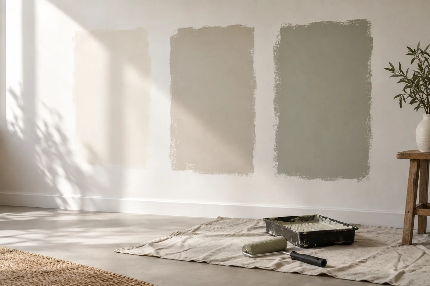
Paint large patches on the actual wall, not just small swatches, and look at them at different times of day and with the lights on. Leave them for a few days, because first impressions change once the novelty passes. Paint onto the same surface type and preparation as the finished wall, since a patch on bare plaster reads differently from a patch on primer.
Sheen and finish
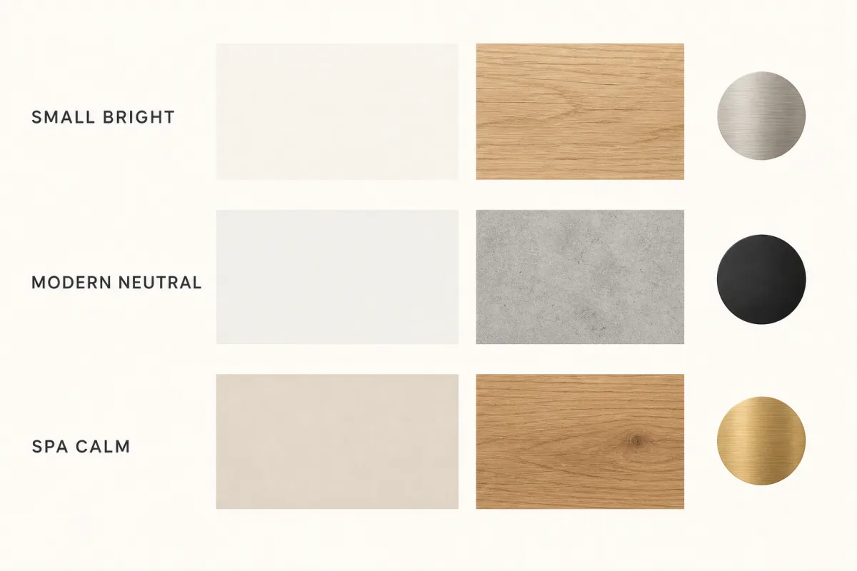
Matte hides imperfections and absorbs light, which suits ceilings and low-traffic walls. Eggshell and satin are easier to clean, so use them where wear and moisture matter. Shinier finishes show every flaw in the plaster, which raises the preparation standard; budget for the extra work if you choose them.
Keep one sheen per room where possible for a calm result, and use a harder-wearing finish on trim and doors rather than on the walls.
Plan the whole palette
Choose wall, trim, ceiling and door colors as one set. Decide where the accent color appears and how much of it you want, and consider the floor, textile and timber tones before finalizing. Write the colors down with the room and the date, because future touch-ups and additions depend on that record.
A palette that is planned as a set is much easier to live with than a collection of individual favorites.
Common mistakes
Choosing from a phone screen in artificial light, trying a sample on a different wall from the one being painted, matching a color to a fabric from memory, and changing too many colors at once are the mistakes that lead to repainting. Each one is easy to avoid with a sample pot and a few days of patience.
Use AI to compare, then use paint to decide. The render is a proposal; the patch on the wall is the truth.
Accent walls, ceilings and trim
An accent wall works best when something about the room already suggests it: a chimney breast, an alcove, a headboard wall or the wall behind a piece of furniture. Painting a random wall in a strong color usually makes the room feel fragmented rather than intentional. If you want to test the idea, ask the render for the accent on one specific wall and compare it with a version where the color is repeated on a smaller element, such as the trim or a single panel.
Ceilings are worth considering if the room is dark or the ceiling is high. A slightly warmer tone than the walls can soften the light and make a large room feel more enclosed, while a true white keeps it bright. Painting trim in a contrasting color is the least risky way to add interest, and it is easy to change later.

Frequently asked questions
Can I choose a paint color from an AI render?
Use the render to compare directions and see how a color sits with the room, but confirm with real paint patches on the wall. Screens and render pipelines change color, so the final decision should be made from samples.
What is the best way to see a paint color in a room?
Paint a large patch on the wall, or use big removable samples, and look at it in daylight and at night. Judge it against the floor, furniture and light direction rather than in isolation.
Do north-facing rooms need warmer colors?
Cooler, dimmer light can make cool colors feel grey, so warmer tones are often more comfortable in north-facing rooms. Test the actual color in the room before deciding.
Use AI to compare, then use paint to decide. The render is a proposal; the patch on the wall is the truth.
This article is general design guidance. Check paint specifications and preparation requirements with the manufacturer for the surface you are painting.