
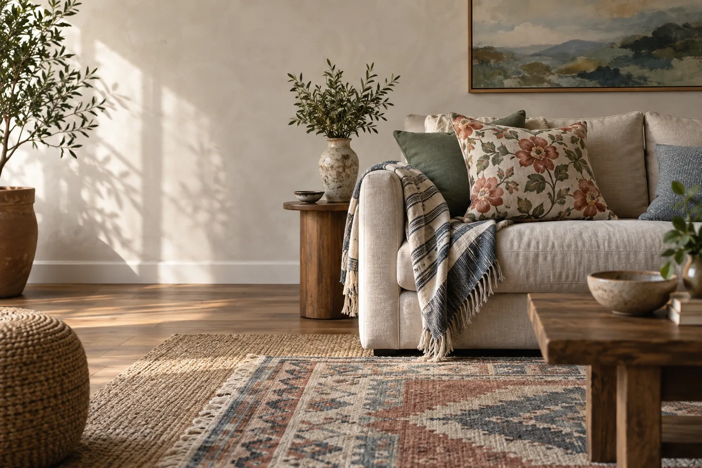
Why pattern mixing goes wrong
Most pattern problems come from scale and color rather than from the patterns themselves. Several medium-sized motifs at similar scale compete with each other, and too many colors with no bridge between them make a room feel restless. Using pattern on every surface leaves the eye nowhere to rest.
The other common cause is buying pieces one at a time without a plan for how they will meet. Each purchase makes sense alone; together they fight.
Start with the color bridge
Choose three or four colors for the room, then let each pattern include at least one of them. Keep one dominant neutral so the eye has somewhere to rest, and use the palette to link different motifs; that shared color is what makes a layered room feel intentional rather than accidental.
- Pick the palette from something fixed, such as the floor, a rug or a piece you already love.
- Test colors in daylight and in the evening, because artificial light changes how patterns read.
- Keep the accent color to a small proportion of the room.
- Write the palette down so future purchases stay coherent.
Vary the scale deliberately
Pair one large-scale motif with one small pattern and one geometric. Keep the sizes clearly different rather than subtly different, because subtle differences look like a mistake. Stripes are visually calm and easy to mix because they read as structure rather than decoration.
Repeating a motif across two items creates rhythm, not a matching set. The same color in a different scale or texture is usually enough.
Distribute patterns through the room
Anchor the floor with a rug, then layer textiles on furniture and windows. Keep large patterns low and smaller patterns higher to feel balanced, and use solid surfaces to separate patterned zones. Limit pattern on the busiest surfaces, such as worktops and backsplashes, where it competes with daily clutter.
Think of the room in layers: floor, seating, windows and walls. Two or three patterned layers are usually enough, with solids and textures doing the rest.
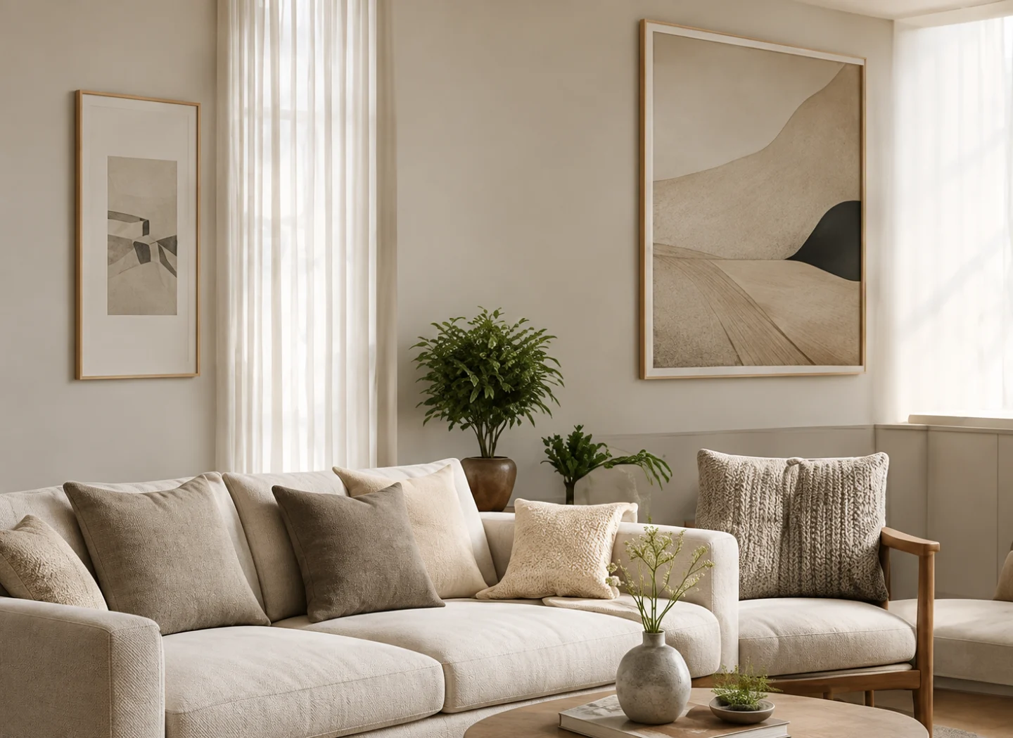
Test with AI before you buy
Photograph the room and preview two or three pattern combinations. Ask for one change at a time: the rug, then the cushions, then the curtains. Compare the render with actual samples, because fabric and rugs behave differently in real light, and use the render to narrow choices rather than to make the final call.
This is where AI saves real money. Returning a rug or a pair of curtains is a nuisance; discovering the palette does not work after three purchases is worse.
Rules of thumb that hold up
One hero pattern, one supporting pattern and one or two texture-led pieces is a reliable default. Solids are not the absence of pattern; they are part of the composition, and they give the eye its resting place. If in doubt, remove one pattern rather than adding one.
Texture can do the work pattern was doing. A boucle cushion, a woven throw and a chunky rug create interest without adding another motif to track.
Where to spend
Invest in the pieces that are hardest to replace: rugs, curtains and upholstery. Cushions and throws are the cheapest way to change the pattern story later, so treat them as the flexible layer. Buy samples of anything upholstered or made to measure, and keep the palette note with your paint colors.
Layering pattern is a slow, deliberate process, and it is much easier when the palette is settled and the purchases are allowed to follow.
Where pattern lives in a rental
When you cannot change the walls or the floor, pattern has to arrive through things you can take with you. A large rug does the work of a feature wall, curtains add vertical pattern and softness, and a quilt cover or a throw can carry the boldest motif in the room without any commitment.
Temporary wallpaper and adhesive panels are worth considering for a single wall, but test a small area first, follow the removal instructions, and check the lease. A removable pattern that damages the paint is not removable in practice.
Frequently asked questions
How many patterns can a room have?
Three is a comfortable default: a hero, a supporting motif and a texture-led piece, linked by a shared palette. Rooms with fewer patterns can still feel rich if the textures and colors are strong.
Can I mix floral and geometric patterns?
Yes, and it often works well. Keep the scale clearly different, link them through two or three shared colors, and give one of them the dominant role.
How do I know if a pattern will work before buying?
Preview the combination in a render, then order physical samples and look at them in the room at different times of day. Renders are useful for direction, but fabric color and texture need real light.
Pattern is composition: a shared palette, clearly different scales, and enough calm space for the eye to rest. Get those three things right and almost any combination can work.
This article is general design guidance. Trust your own room and samples over any rule, including these.