
Choosing a bathroom color palette is easier when you can see the relationship between every surface before buying materials. A bathroom color palette AI visualizer lets you upload a room photo, test coordinated colors, and generate renovation ideas for walls, tile, cabinetry, fixtures, and accents. The best approach is to use AI for visual exploration, then confirm measurements, lighting, product availability, and installation requirements before making decisions.
This guide explains how to build a bathroom palette that looks intentional, works with your existing features, and fits your renovation budget.
Try it with your photo: Open Studio to upload a clear bathroom photo and test one palette below. Use AI to compare directions, then confirm with physical samples and check pricing scope before buying.
## What is a bathroom color palette AI visualizer?
A bathroom color palette AI visualizer is a design tool that uses a bathroom photo and color or style instructions to create visual renovation concepts. Depending on the tool, you may be able to preview changes to:
– Wall paint and ceiling color
– Floor and shower tile
– Vanity cabinets
– Countertops and backsplashes
– Hardware and plumbing fixtures
– Mirrors, lighting, towels, and accessories
– Wood tones, patterns, and accent colors
It is most useful during the planning stage, when you are comparing directions rather than selecting exact products. An AI visualization can help answer questions such as: Will a dark vanity overwhelm a small bathroom? Does warm white work with the existing floor? Would green tile clash with brass hardware? Should the ceiling match the walls?
Treat the result as a design preview, not a construction drawing. Colors may appear different on screens, and AI may simplify grout lines, reflections, plumbing, or room dimensions. Use the visual to narrow your choices, then validate the final plan with physical samples and qualified professionals where necessary.
## Start with the bathroom’s fixed features
Before choosing a palette, identify what is staying. Replacing a bathroom’s permanent finishes can quickly increase the scope and cost of a project, so the most successful color plans usually work with at least some existing elements.
Look at:
– Floor tile and shower tile
– Tub, toilet, and sink color
– Countertop material
– Existing vanity or storage
– Window size and natural light
– Metal finishes on faucets, lighting, and accessories
– Door, trim, and baseboard color
If the floor tile is beige, a cool gray palette may make it look outdated or disconnected. If the countertop has warm veining, creamy whites, taupe, muted green, or soft blue may coordinate more naturally than stark blue-white paint.
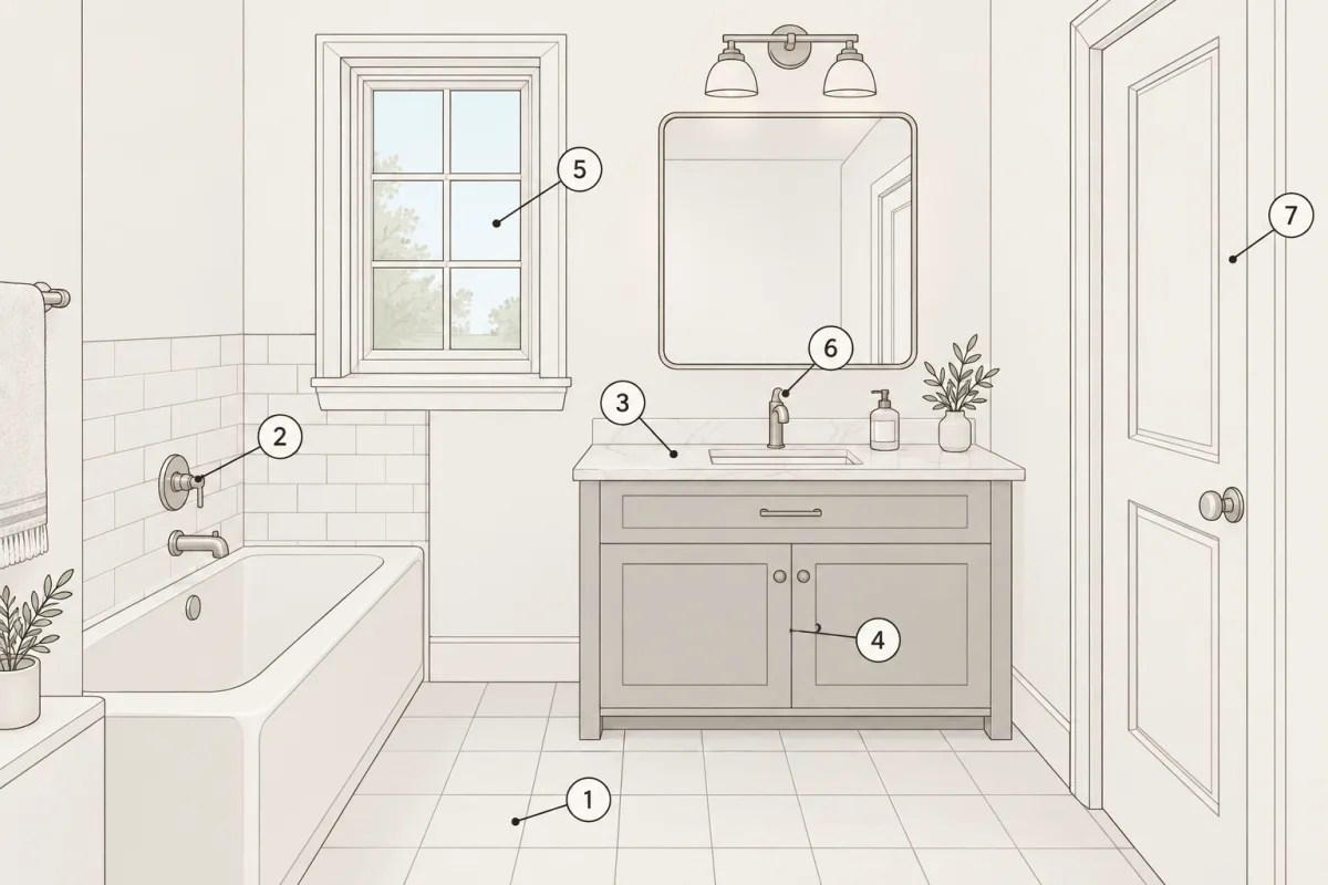
Take a clear, well-lit photo before using the visualizer. Include as much of the room as possible, keep vertical lines straight, and remove clutter that could make the design harder to interpret. If the bathroom has limited natural light, take one photo with the lights on and another during the day.
Photo checklist before you visualize: Include floor + shower tile, sink/tub/toilet color, countertop, vanity, window, faucets/lights, door/trim. Take one photo with lights on and one in daylight, straight verticals, decluttered. See Figure 2.
## A simple color structure for bathrooms
A practical bathroom palette often contains three layers:
1. **Base color:** The largest visual area, such as walls, floor, or large-format tile.
2. **Supporting color:** A vanity, shower tile, countertop, or painted ceiling that adds contrast or depth.
3. **Accent color:** Hardware, textiles, artwork, plants, or a small tile detail.
A balanced palette does not require three completely different colors. You can use several shades of one color family, such as ivory walls, warm white tile, and tan textiles. The important point is to control contrast and repetition.
Use the table below as a starting framework.
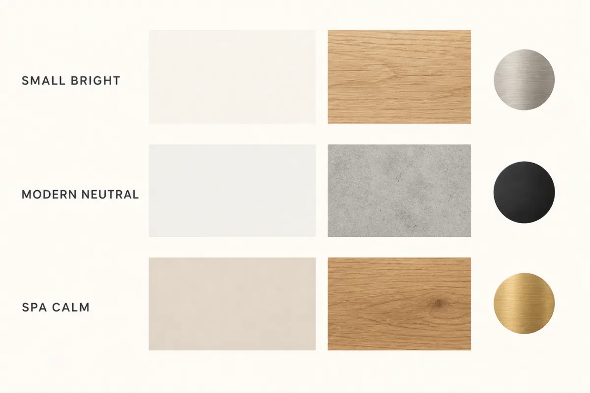
| Bathroom style or condition | Base color ideas | Supporting colors | Accent finishes | Best use |
|---|---|---|---|---|
| Small bathroom with limited light | Warm white, pale ivory, soft greige | Light oak, pale stone, muted beige | Brushed nickel or soft brass | Keeps the room bright without feeling sterile |
| Modern neutral bathroom | Soft white, gray-beige, charcoal | Concrete gray, walnut, black details | Matte black or chrome | Creates clean contrast with simple forms |
| Spa-inspired bathroom | Sand, cream, misty blue | Natural wood, limestone tones | Brushed brass or nickel | Adds warmth and a relaxed atmosphere |
| Classic bathroom | Cream, light taupe, pale blue | White tile, painted cabinetry | Chrome, polished nickel, or brass | Works well with traditional trim and fixtures |
| Color-forward powder room | Deep green, navy, terracotta, or plum | Coordinated tile or wood tone | Brass, black, or aged bronze | Makes a compact room feel intentional and expressive |
| Family bathroom | Mid-tone greige, muted blue, sage | White tile, durable wood-look finishes | Chrome or satin nickel | Hides everyday wear while staying versatile |
How to test in Studio in 3 steps: 1. Upload daylight photo. 2. Test Base first, then Supporting, keep Accent to 1 metal + textiles. 3. Generate 2 versions of same view — e.g. warm white walls, light oak vanity, brushed nickel vs same with brushed brass — compare bright/dim viewing.
Prompts to copy: warm white walls, light oak vanity, pale stone tile, brushed nickel fixtures, same layout / sage vanity, creamy white tile, warm wood mirror, chrome fixtures, same layout
Related proof: Before and after: Bathroom in Traditional — Bathroom in Mediterranean — Bathroom in Modern
Your own Studio proof: generate the two prompt versions above from your own bathroom photo in Open Studio and compare them side by side under bright and dim viewing before buying samples.
## Popular bathroom palette directions to test with AI
### Warm white and natural wood
Warm white walls with a light or medium wood vanity create a comfortable, adaptable bathroom. This combination works especially well when the room already has beige flooring, cream countertops, or warm light bulbs.
Ask the visualizer to show warm white walls, a natural oak vanity, light stone tile, and brushed nickel fixtures. Then compare it with a version using brushed brass. Brass can add warmth, but it should be repeated thoughtfully through the mirror frame, light fixture, cabinet pulls, or accessories.
### Soft green and creamy neutrals
Muted sage, eucalyptus, and olive-leaning greens can bring a natural feeling without dominating the room. Pair a soft green wall or vanity with creamy white tile, warm wood, and understated metal finishes.
For a small bathroom, consider using green on the vanity or lower half of the room instead of every wall. In a bathroom with strong daylight, a slightly grayer green may look calm. In a darker room, a warmer, lighter green can prevent the space from feeling heavy.
### Blue, white, and brushed nickel
Blue and white remain practical choices for bathrooms because they suggest cleanliness and work with many fixture styles. Pale blue creates an airy effect, while navy or dusty blue adds more depth.
Use the visualizer to compare pale blue walls with white subway tile, then test a richer blue vanity with the same tile. If the result feels too cool, introduce a warm wood mirror, woven basket, beige runner, or cream-colored accessories.
### Greige with black accents
Greige combines gray and beige, making it useful when a room contains both cool and warm elements. It can provide a quieter background for patterned tile, dark hardware, or a wood vanity.
Black accents add definition, but too much black can make a small bathroom feel visually busy. Preview black only on selected elements, such as the mirror frame and cabinet pulls, while keeping larger surfaces lighter.
### Terracotta and earthy stone
Terracotta, clay, rust, and muted peach can give a bathroom character, particularly in a powder room or bathroom with Mediterranean, desert, or collected design influences. Balance these colors with off-white, sand, natural wood, or pale stone.
Use a visualizer to test terracotta on one wall, the vanity, or a tile accent rather than assuming the entire room should be saturated. A smaller dose may be easier to live with and less expensive to change later.
## Room-specific examples
### Small hall bathroom
A small hall bathroom often needs to serve guests and family members, so flexibility matters. Try warm white walls, a light wood or painted vanity, pale floor tile, and a simple accent in sage, blue, or black.
To make the room feel more spacious, keep the largest surfaces light and use one consistent metal finish. Ask the visualizer to show the same room with a wall-mounted mirror, a lighter vanity, and fewer contrasting tile lines. This can help you decide whether visual simplicity is worth prioritizing over a bolder pattern.
### Primary bathroom
A primary bathroom can support more layered color because it is usually designed around the homeowners’ preferences. Consider a warm neutral base with a deeper vanity color, such as forest green, navy, walnut, or charcoal.
Preview the palette under both bright and dim lighting. A color that feels refined in daylight may appear much darker at night. If the bathroom includes a large shower, use the visualizer to compare a full-height accent tile with a quieter shower surround.
### Guest bathroom
A guest bathroom benefits from a welcoming palette that does not rely on highly personal colors. Warm white, light taupe, pale blue, soft green, and natural wood are dependable starting points.
Use contrast in small, replaceable elements: towels, art, a mirror frame, or a painted vanity. This makes it easier to refresh the room without replacing tile or plumbing fixtures.
### Powder room
A powder room is a good place to experiment because it is compact and typically has fewer moisture-intensive surfaces. Deep green, navy, plum, terracotta, or a dramatic wallpaper-inspired palette can work well.
Ask the AI visualizer to generate two or three intensity levels. Compare a fully saturated version with a lighter version that uses the bold color only on the vanity or one wall. Check how the palette interacts with the mirror, lighting, and door trim.
### Bathroom with existing beige tile
Do not automatically cover beige tile with gray. Instead, test colors that connect with its undertones: creamy white, mushroom, taupe, muted green, dusty blue, or warm charcoal.
If the tile is staying but looks too plain, use paint, hardware, lighting, mirrors, and textiles to update the room. A visualization can show whether these smaller changes provide enough contrast before you commit to demolition.
Make it part of your plan. Start my project — keep your two favorite palettes and must-keep vs refresh list for Services scoping.
## Cost-aware palette planning
Color decisions affect more than appearance. They can also influence the cost and difficulty of the renovation.
Paint is generally easier to change than tile, countertops, plumbing fixtures, or cabinetry. If you are uncertain about a bold color, use it first on a wall, vanity, or accessory. Save permanent high-contrast choices for locations where you are confident they will work with the rest of the room.
Large-format tile may create a calmer visual field with fewer grout lines, but product price and installation requirements vary. A simple tile can still look distinctive when paired with a carefully chosen grout color and a strong vanity finish.
When using AI concepts, separate the visual decisions from the purchasing decisions. Make a list of items that must be replaced and items that could be refreshed. This helps prevent an attractive rendering from turning into an unnecessarily large project.
AI concept preview. Colors vary by screen and lighting; grout, reflections and dimensions may be simplified. Confirm with samples, measurements, product availability and installer. Not a construction drawing.
## Mistakes to avoid
– **Choosing colors from a screen alone:** Display settings and lighting can change how a color appears. Order samples or use paint swatches in the actual room.
– **Ignoring undertones:** White, gray, beige, green, and blue can all lean warm or cool. Compare samples beside the existing floor and countertop.
– **Using too many metal finishes:** A mixed-metal look can work, but random combinations often feel accidental. Select one primary finish and one optional secondary finish.
– **Making every surface equally bold:** If the walls, floor, shower tile, vanity, and accessories all compete, the room can feel chaotic. Choose a focal point.
– **Forgetting artificial light:** Warm bulbs can make creams and beiges look richer while muting some blues and greens. Preview the room at different times of day.
– **Assuming AI understands construction:** A visualization may show impossible plumbing, unsupported shelves, incorrect tile layouts, or fixtures in locations that cannot work. Confirm technical details separately.
– **Overlooking maintenance:** Very dark or very light surfaces may show water spots, dust, hair, or mineral buildup more clearly. Consider how the room will be cleaned and used.
– **Changing the palette without repeating it:** A color feels more intentional when it appears in at least two or three related details, such as the vanity, artwork, and towels.
## Bathroom color palette checklist
Use this checklist before finalizing a concept:
– [ ] I identified the fixed features that will remain.
– [ ] I photographed the bathroom in clear natural and artificial light.
– [ ] I chose a base, supporting, and accent color direction.
– [ ] I tested the palette with the existing floor and countertop.
– [ ] I checked how the colors look in a small and large visual area.
– [ ] I selected a primary metal finish.
– [ ] I considered cleaning, moisture, and everyday wear.
– [ ] I separated cosmetic updates from structural work.
– [ ] I checked product samples in the actual room.
– [ ] I confirmed measurements, ventilation, waterproofing, and installation details before ordering.
## FAQ
### Can an AI visualizer choose the perfect bathroom colors?
It can help you compare coordinated directions, but there is no universally perfect palette. The best choice depends on your lighting, fixed finishes, room size, maintenance preferences, and budget. Use AI to explore and narrow options, then validate the finalists with real samples.
### What colors make a small bathroom look bigger?
Light warm whites, soft ivory, pale greige, muted blue, and gentle sage can make a small bathroom feel more open. A consistent palette, reflective surfaces, and fewer visual breaks may matter as much as the specific color.
### Should the bathroom ceiling match the walls?
The ceiling can match the walls, use a lighter version, or remain a coordinated white. Matching can create a more enveloping look, while a lighter ceiling may help a low or dark room feel more open. Preview both options in the visualizer.
### Is gray still a good bathroom color?
Gray can work well when its undertone matches the room’s existing finishes. Warm gray or greige is often more compatible with beige tile and wood, while blue-gray may suit cooler white tile and chrome. Test gray beside the permanent materials before choosing it.
### How many colors should a bathroom palette include?
A practical starting point is two or three main color families, supported by variations in texture and finish. You can create a rich result with one color family if the room includes differences in tile, wood, metal, and textiles.
### Can I visualize a bathroom without remodeling everything?
Yes. You can ask for concepts that preserve the tub, toilet, floor, vanity, or tile while changing only paint, lighting, hardware, mirrors, and accessories. This is especially helpful when you want a lower-cost refresh.
### What should I do after generating a bathroom concept?
Save your preferred versions, compare them side by side, and identify the elements that appear in every favorite. Then collect physical samples, confirm measurements and product specifications, and request professional advice for electrical, plumbing, waterproofing, or structural work.
## Turn your bathroom photo into renovation ideas
The fastest way to discover a workable palette is to see it in your own space. Upload a room photo to roomrenovation.ai and generate bathroom renovation ideas based on your existing layout, finishes, and preferred style. Use the results to compare color directions, identify affordable updates, and plan the next step with greater confidence.