Renovation Ideas
10 AI Room Design Styles Ranked: Which One Is Right for Your Home?
Compare ten AI room design styles with a practical fit matrix, a worked example, and a photo-based process for choosing a direction that suits your room.
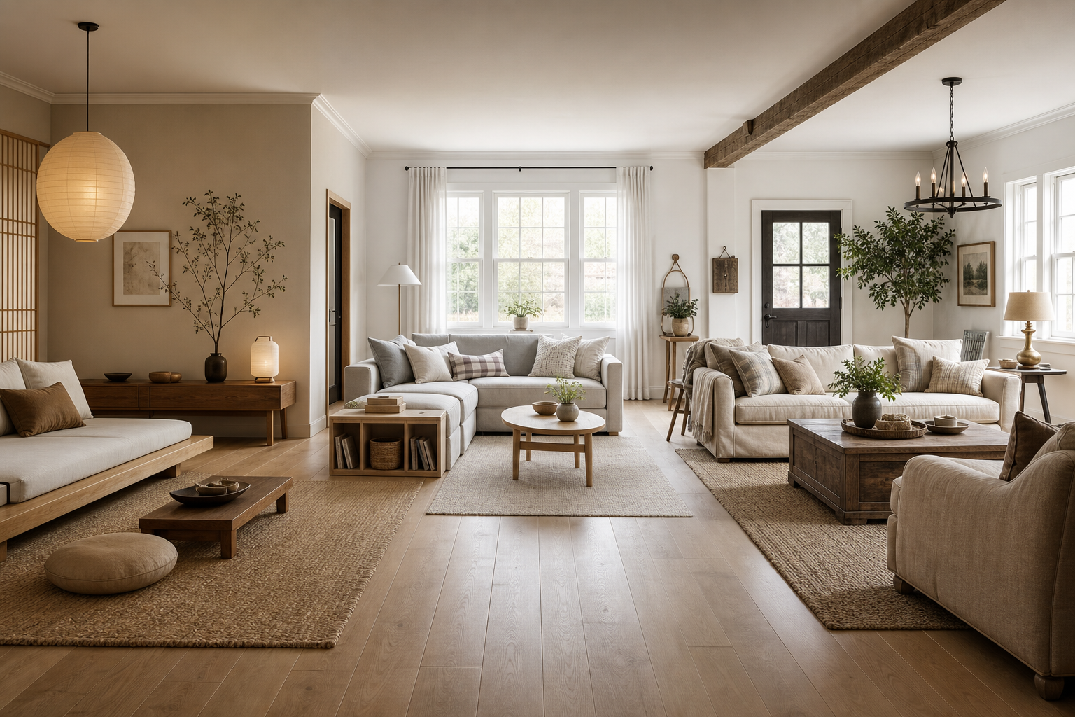
If you want one practical answer, choose the style that agrees with both your room’s existing character and the way you need to use it. Japandi or Scandinavian usually suit a calm, restrained brief; Coastal works with strong daylight and relaxed materials; Modern Farmhouse suits durable, informal homes; Mid-Century belongs with period-appropriate architecture; Industrial needs convincing structural cues; Bohemian, Art Deco, Tropical and Maximalist are more personal and should be tested carefully. Start with your actual room photo, shortlist three styles, and compare each against light, fixed features, maintenance, and the amount of change you are prepared to make. The highest-ranked style is not automatically the right one for your home.
How this ranking works
This is an editorial decision aid, not a survey of homeowners, a cost database, or a measured assessment of image-model performance. The order reflects how useful each direction tends to be as a starting brief when you consider five visible questions:
- Architectural fit: Does the style reinforce the room’s period, proportions, and fixed features?
- Light and context: Does its palette and material language suit the daylight, outlook, climate, and surrounding rooms?
- Practical tolerance: Can the household live with the cleaning, wear, upkeep, visual busyness, and furniture demands?
- Renovation scope: Can the direction be expressed with movable pieces and finishes, or does it depend on structural work?
- Comparison clarity: Will a same-photo preview make the difference between options easy to discuss?
Use the ranking to create a shortlist, then use the matrix below to overrule it when your room provides stronger evidence.
10 styles ranked for real-room decision making
1. Japandi — warm restraint
Japandi combines clean geometry with natural textures, warm neutrals, and deliberate empty space. It is a strong first test for newer construction, apartments, and rooms where visual calm matters. It can also soften a contemporary shell without requiring a dramatic theme. The trade-off is that low visual noise depends on editing: too many objects, competing wood tones, or delicate textiles can weaken the idea. Treat a preview as direction for proportion, palette, and furniture placement, not proof that a particular stone, timber, or fabric will perform as shown.
2. Coastal Modern — light, relaxed materials
Coastal Modern uses a pale, breathable palette, organic texture, and an informal arrangement without relying on nautical decoration. It makes sense where daylight and a relaxed context already exist, including bright living spaces and holiday properties. In a dark room, a pale preview may look appealing while concealing the work needed to make the real space feel equally open. Watch for moisture, glare, and the maintenance of light upholstery. Keep the brief contemporary: tonal texture and natural shapes are more durable as a direction than literal beach motifs.
3. Modern Farmhouse — practical warmth
Modern Farmhouse is built from warm wood, restrained contrast, simple joinery, and familiar, durable forms. It can work well in suburban homes, cottages, and rooms with a fireplace or other strong domestic feature. Its accessible character makes it useful when you want a noticeable change without replacing every element. The risk is repetition: too much shiplap, barn-inspired hardware, or forced rustic decoration can make the room feel staged. Use the style as a material and comfort brief, and let the home’s architecture decide how much country reference is appropriate.
4. Mid-Century Modern — let the building lead
Mid-Century Modern is most convincing when the room already has compatible proportions, glazing, timber, or a period connection. Low furniture, clear circulation, and a focused palette can also be adapted to a later home, but the result needs discipline. The style depends on silhouettes and scale as much as colour, so a preview is valuable for testing furniture relationships. Do not use an image to authenticate vintage pieces or specify joinery. If your home is ornate or heavily traditional, compare this option against a style that acknowledges those fixed details before committing.
5. Scandinavian — clear and functional
Scandinavian design favours light tones, simple lines, practical storage, and an uncluttered arrangement. It is a sensible candidate for apartments, compact rooms, and households that want function to be visible rather than hidden behind ornament. Its weakness is potential sterility: a small, cool room may need warmer timber, layered lighting, and tactile textiles to avoid appearing flat. The style is easier to adapt than Japandi when practicality and replaceable furnishings are priorities, but it still requires an honest storage plan. Ask whether the real room can remain clear after daily use.
6. Industrial — only where the structure supports it
Industrial design works best when the room has authentic cues such as exposed services, generous ceiling height, robust surfaces, or a warehouse-like shell. Raw steel, concrete, darker tones, and open fittings can be introduced selectively, but manufacturing those cues from scratch may expand the scope. In a conventional suburban room, a restrained industrial accent may be more credible than a complete conversion. Compare how the style treats warmth, acoustics, and everyday comfort; a dramatic render can understate hard surfaces, glare, and the effort of keeping open shelving organised.
7. Bohemian — personal layering
Bohemian rooms use collected objects, varied textiles, plants, pattern, and warm colour. The strength is personal expression: the direction can absorb inherited pieces and evolve over time. The challenge is that its success depends on the specific objects, not simply on a palette. A generic preview can suggest density and colour relationships while missing the meaning of your collection. Use it to test broad composition, then assemble a small physical edit of fabrics, art, and furniture before making permanent changes. Set a boundary for circulation and cleaning so layering does not become obstruction.
8. Art Deco — geometry with a material bill
Art Deco brings symmetry, strong geometry, contrast, and a sense of ceremony. It can suit pre-war apartments, rooms with generous trim, or a brief that deliberately embraces glamour. Brass, lacquer, marble-look surfaces, velvet, and patterned treatments can quickly increase both visual and practical demands. A preview is particularly useful for deciding how much geometry the room can carry, but it cannot establish the finish quality or installation detail. Consider a focused intervention—lighting, a mirror, hardware, or one patterned surface—before proposing a full room of high-contrast materials.
9. Tropical — context and maintenance first
Tropical interiors combine lush planting, rattan or woven texture, saturated colour, and an indoor-outdoor sensibility. They are easiest to make coherent when climate, daylight, ventilation, and the surrounding landscape support the language. In a different context, use the direction as a controlled palette and texture study rather than importing every motif. Plants, natural fibres, humidity, and strong sun introduce maintenance questions that a preview cannot answer. Check whether the room can support the care routine and whether the materials you are considering are suitable for their actual environment.
10. Maximalist — deliberate abundance
Maximalism is not simply adding more colour. It is a coordinated collection of pattern, art, objects, and contrasting surfaces. The reward is a room with strong identity; the risk is that the right balance is highly personal and difficult to specify from a generic image. Test one composition at a time: anchor colour, repeat a shape, protect a clear route, and identify where the eye should rest. Use the preview as a mood board, then work with the actual pieces you own. This direction should not be used to hide unresolved storage, lighting, or circulation problems.
RoomRenovation Style Fit Matrix
Score each candidate using yes, partial, or no. “Yes” means the room already supplies useful evidence; “partial” means the idea could work with a deliberate adjustment; “no” means the style would be compensating for a mismatch.
| Style | Architectural fit to look for | Light/context fit | Practical trade-off | Typical renovation scope | Yes/no decision cue |
|---|---|---|---|---|---|
| Japandi | Clean lines, modest ornament | Soft or controllable light; calm surroundings | Requires editing and material discipline | Furniture, paint, lighting, selected finishes | Yes if calm matters more than display |
| Coastal Modern | Simple shell, relaxed proportions | Strong daylight or an open outlook | Pale fabrics and surfaces need care | Furniture, colour, texture, light finishes | Yes if the room already feels airy |
| Modern Farmhouse | Cottage, craftsman, or informal domestic cues | Warm daylight; family use | Rustic details can become repetitive | Paint, joinery accents, furniture | Yes if durability and warmth lead |
| Mid-Century Modern | Period proportions, glazing, timber | Clear light and open circulation | Correct scale matters; vintage claims need checking | Furniture and lighting; sometimes joinery | Yes if the building supports the silhouettes |
| Scandinavian | Any simple, compact shell | Useful for low-light rooms, with warmth added | Clutter quickly defeats the concept | Storage, paint, furniture, lighting | Yes if function must stay visible |
| Industrial | Loft-like height, masonry, exposed services | Urban or directional light | Hard surfaces affect comfort and upkeep | Potentially substantial surfaces and fittings | Yes only if structural cues are credible |
| Bohemian | Flexible architecture; collected details | Light that supports plants and textiles | Layering increases cleaning and circulation demands | Mostly movable pieces and soft finishes | Yes if your real objects are the design |
| Art Deco | Period trim, symmetry, or a formal room | Controlled light for contrast and sheen | Materials and detailing can be demanding | Focused accents to full finish package | Yes if geometry is already present or intentional |
| Tropical | Indoor-outdoor connection or generous greenery | Suitable climate, ventilation, and daylight | Plant and material maintenance is real | Texture, planting, colour, sometimes finishes | Yes if care and context are sustainable |
| Maximalist | A room that can carry visual density | Lighting must separate layers | Editing is continuous; storage is essential | Objects, paint, textiles, lighting | Yes if you have a clear collection logic |
A simple selection rule
Give each style one point for every “yes” in the five decision areas, half a point for “partial”, and zero for “no”. Then subtract one point for any non-negotiable conflict, such as a fabric you cannot maintain, a circulation route you cannot lose, or a structural feature you will not alter. This is not a market score or a prediction. It is a transparent way to explain why three candidates remain and why the others do not.
Example: choosing a direction for a shaded apartment living room
Imagine a living room in an apartment with modest daylight, a fixed window position, a long uninterrupted wall, limited storage, and a household that wants easy cleaning. This is an illustrative scenario, not a report of a real project.
The first pass removes Coastal Modern and Tropical as automatic front-runners because the room does not begin with abundant light or a strong indoor-outdoor context. Industrial also loses a point if there are no convincing structural cues and hard finishes would worsen comfort. Maximalism may be attractive, but limited storage and easy-clean requirements make it a demanding default.
The shortlist becomes Scandinavian, Japandi, and Modern Farmhouse. Scandinavian scores well for function and a light palette, but the brief needs warmer texture so the shaded room does not feel clinical. Japandi offers calm and can work through furniture, lighting, and a restrained palette, but the household should avoid fragile upholstery. Modern Farmhouse supplies warmth and durable character, though too much dark iron or rustic texture could absorb the available light.
The decision is therefore not “Japandi always wins”. It is: test all three with the same source photograph, keep the camera angle and fixed wall unchanged, and compare the previews for perceived warmth, storage clarity, circulation, and the amount of maintenance each implies. If the Japandi version looks calm but impractical, Scandinavian may be the better brief. If the farmhouse version makes the room feel heavier, retain its warmth through timber and textiles rather than its full decorative vocabulary.
Three-step same-photo comparison checklist
- Prepare one honest source photo. Photograph the room as it is, with fixed features visible and the main route through the room readable. Note what cannot move: windows, doors, radiators, built-in units, and structural walls. Do not remove inconvenient objects merely to make one option look better.
- Render the shortlist consistently. Upload the same real room photo and compare the three selected directions while preserving the room’s structure and camera angle. Change the style direction, not the evidence. RoomRenovation Studio describes this workflow as transforming style, furniture, and finishes while keeping the room’s walls and layout; you can open RoomRenovation Studio to make the comparison.
- Judge against the room, not the novelty. For each preview, mark warm/cool, calm/busy, easy/demanding, and low/high scope. Circle any element that would require a measurement, trade, approval, or product sample. Keep the option that remains convincing after those practical notes are visible.
Implementation steps after the shortlist
- Write a one-sentence brief: name the style direction, room, intended feeling, three materials or colours, and one thing to avoid.
- Separate movable from fixed decisions: furniture, rugs, paint, and lighting are different commitments from electrical work, plumbing, walls, windows, and built-ins.
- Measure before purchasing: record wall lengths, ceiling height, door swings, clearances, and service positions. An image is not a scale drawing.
- Build a small physical palette: compare actual paint cards, flooring or worktop samples, upholstery, and metal finishes in the room’s changing light.
- Sequence the work: solve safety, moisture, structure, services, and layout before decorative layers. Confirm permissions and technical details with the appropriate local professionals.
- Keep a fallback version: define the smallest change that still expresses the direction if scope, supply, or maintenance makes the full concept unsuitable.
Limitations and trade-offs
An AI room preview is a visual aid, not a survey, measured plan, specification, permit document, or confirmation of structural feasibility. It may place furniture at an implausible scale, simplify a junction, invent a finish, or make light appear more even than it is. It cannot establish whether a wall is load-bearing, whether wiring or plumbing can move, whether a material is safe and suitable for its environment, or what a local authority, landlord, building manager, or insurer will require.
Style labels are also porous. A room can combine Scandinavian storage with Art Deco lighting or Japandi restraint with farmhouse texture. The matrix deliberately favours explainable choices over a false sense of precision. Costs, availability, installation methods, durability, and resale considerations vary by location, room condition, specification, and trade. Obtain measurements, samples, quotations, and technical advice before ordering or building. If a preview conflicts with the physical room, trust the physical evidence.
FAQ
Which room design style is best for a small room?
Start with Scandinavian or Japandi if you need clear circulation and visual calm, then test the actual room. The better choice is the one that preserves storage, scale, and usable floor area; a pale palette alone does not fix an overcrowded plan.
Should I choose a style that matches my house’s age?
Usually use the building’s fixed character as evidence rather than a rule. Mid-Century, Art Deco, and Industrial directions benefit most from compatible architectural cues, while furnishings and colour can adapt other styles. Compare a respectful version with a deliberately contrasting one before deciding.
Can an AI preview tell me what materials to buy?
No. It can help you discuss colour, texture, furniture relationships, and overall direction. Verify product identity, dimensions, slip resistance, moisture suitability, cleaning requirements, fire or building requirements, and installation details separately.
How many styles should I compare?
Three is a useful working shortlist: enough contrast to expose trade-offs without turning the exercise into an endless gallery. Begin with the matrix, then keep the candidates that answer different needs—for example, warmth, calm, and maximum architectural compatibility.
What if none of the ten styles feels right?
Use the closest style as a vocabulary rather than a box. Keep the elements that solve your room’s real constraints, remove the ones that feel borrowed, and name the resulting hybrid in your own brief. The purpose of the ranking is clearer decisions, not forced loyalty to a label.
What should I do before acting on a preview?
List the room’s fixed conditions, measure it, test physical samples, identify technical or permission questions, and ask qualified professionals to confirm any construction decision. Use the preview to improve the conversation, not to replace that verification.